
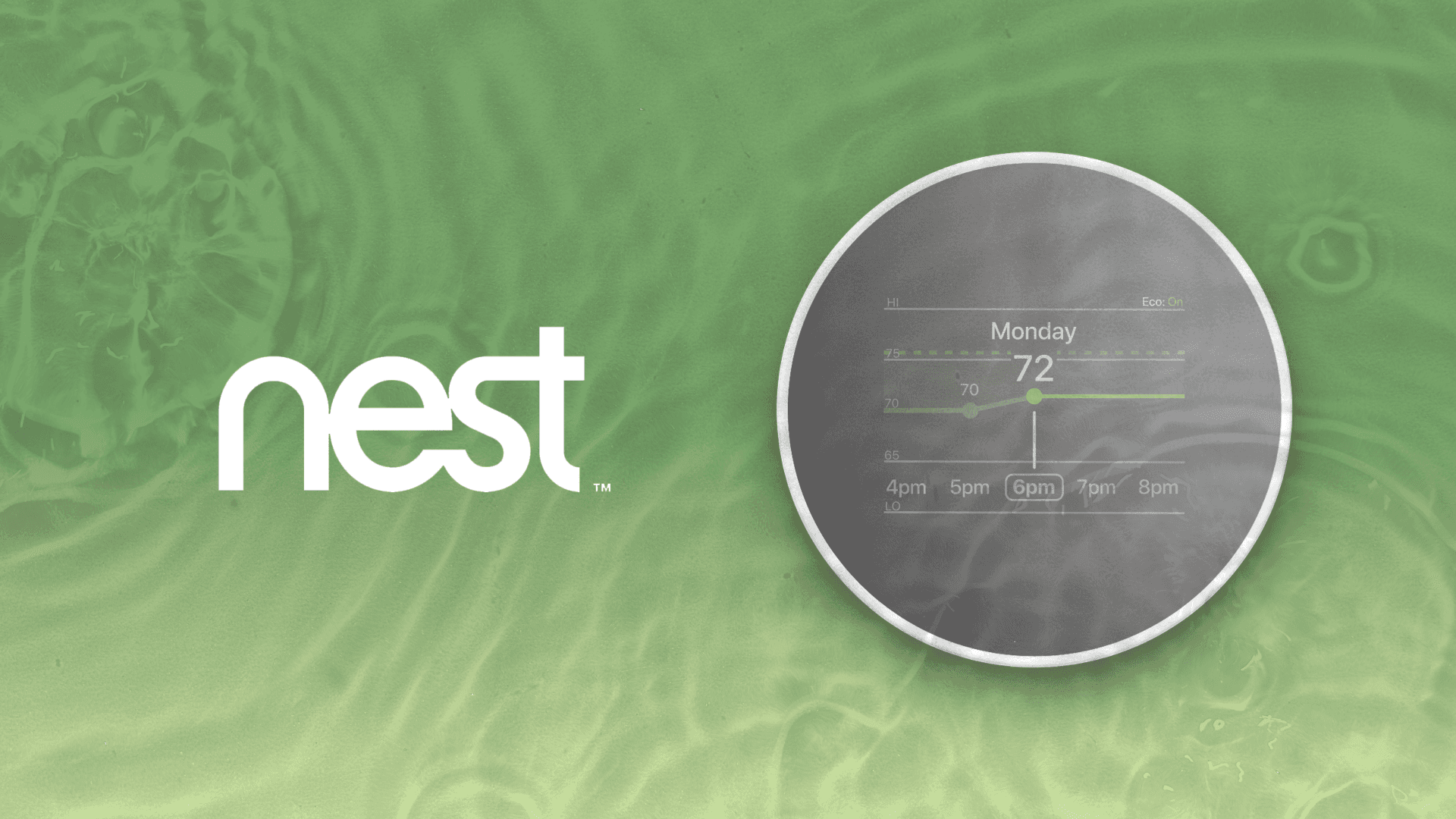
Nest Thermostat
A redesign of the Google Nest thermostat through a eco-friendly and affordable lens.
Project Lead, UX Designer
Timeline
10 Weeks
Tools
Figma, Adobe
7 Designers
TLDR
I led a redesign project for the Google Nest thermostat, resulting in a 83% user satisfaction score.
My Role
As team lead, I focused on project scope and vision, ensuring deadlines and group cohesion. As a UX designer, I contributed to visual design, wireframing, usability testing, user testing, and rapid prototyping.
Background
Learning capabilities on today's smart thermostats can collect data on when activities start and end in the house. Based on programming adjustments surrounding household activity, that usually leads to more accurate implementation of eco modes and lowered settings that save money.
Consumer Reports
Challenge
Google has decided to divest non-core businesses and aims to reimagine Nest with a focus on eco-friendliness and affordability.
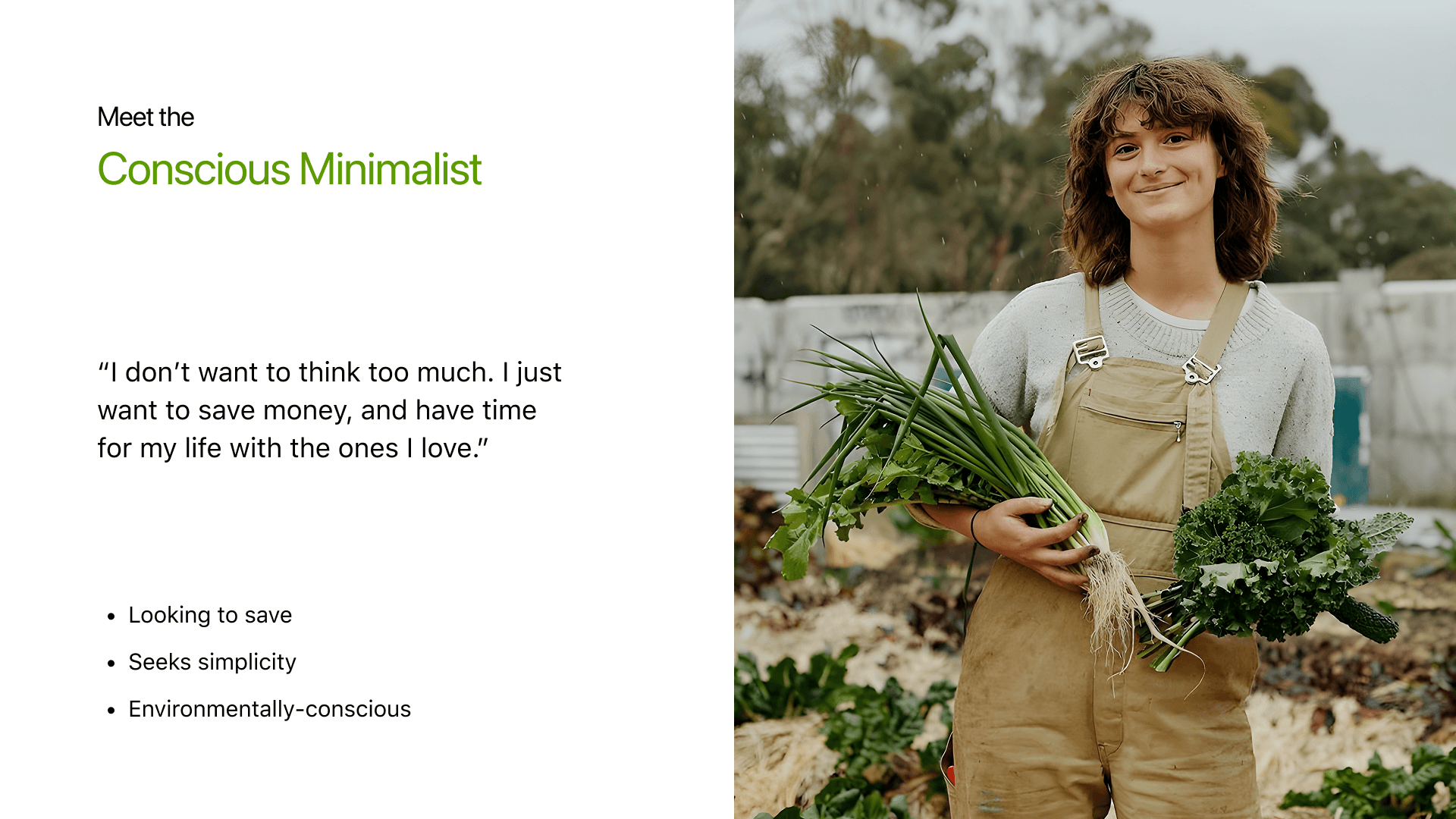
User Persona
Ideation
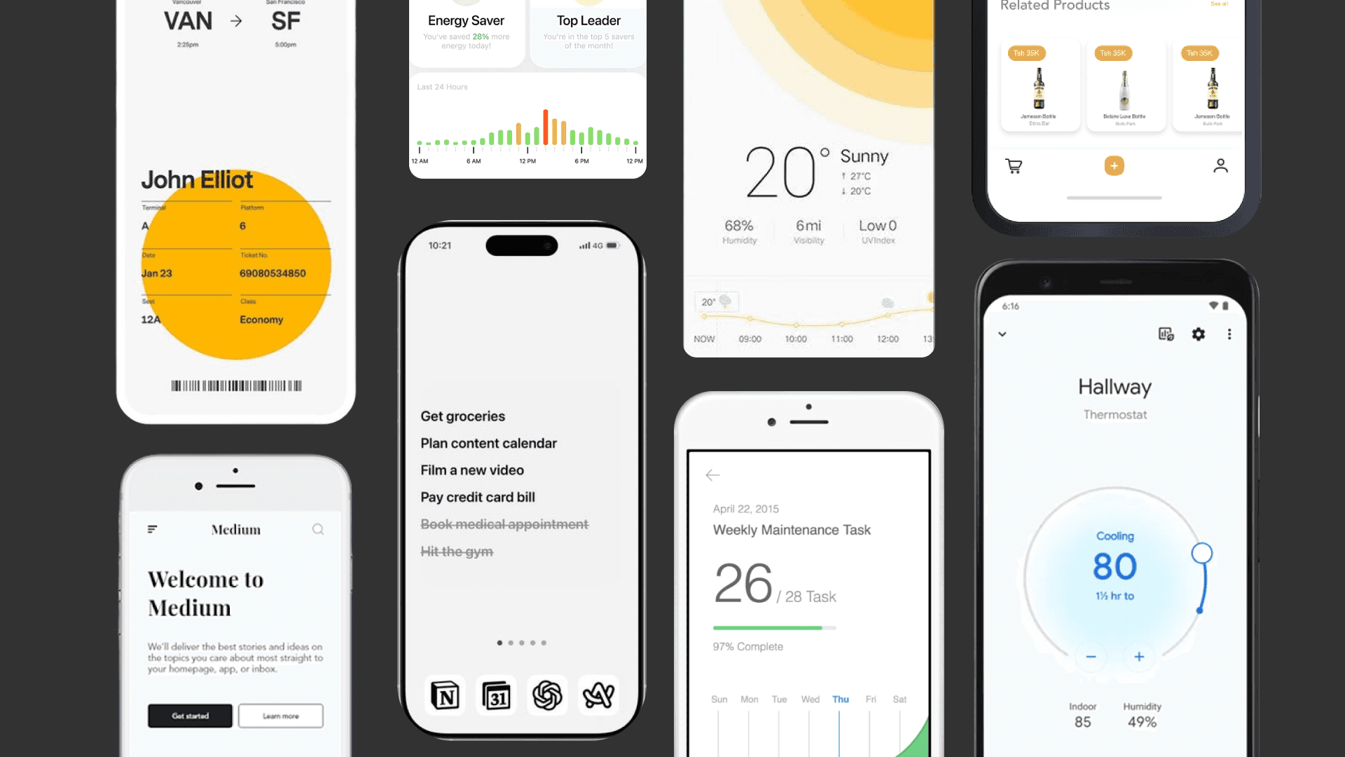
We gathered over 360 images from all over the web and boiled it down to 10 design directives. To open our team's creativity, each member was tasked each creating over 60 sketches within a 24 hour span.
Design Directives
We had 10 design directions informing us of color temperature, shape language, amount of negative space, background colors, amount of text sizes, type of graphic elements, etc.
Sketches
By sketching within the constraints of one work day, we were able to throw out all our boring ideas for refreshing, surprising ideas.
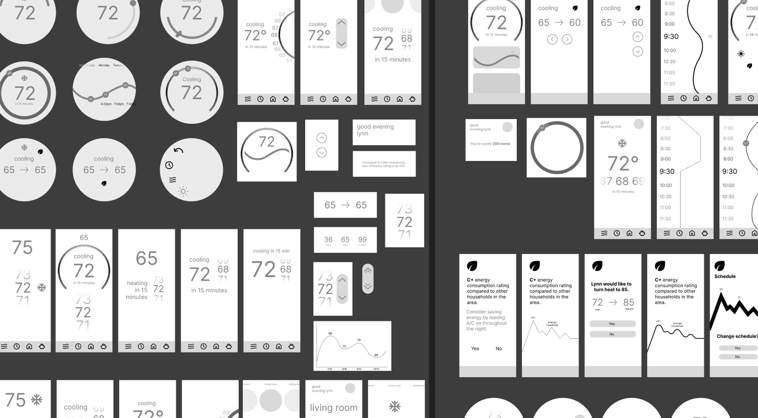
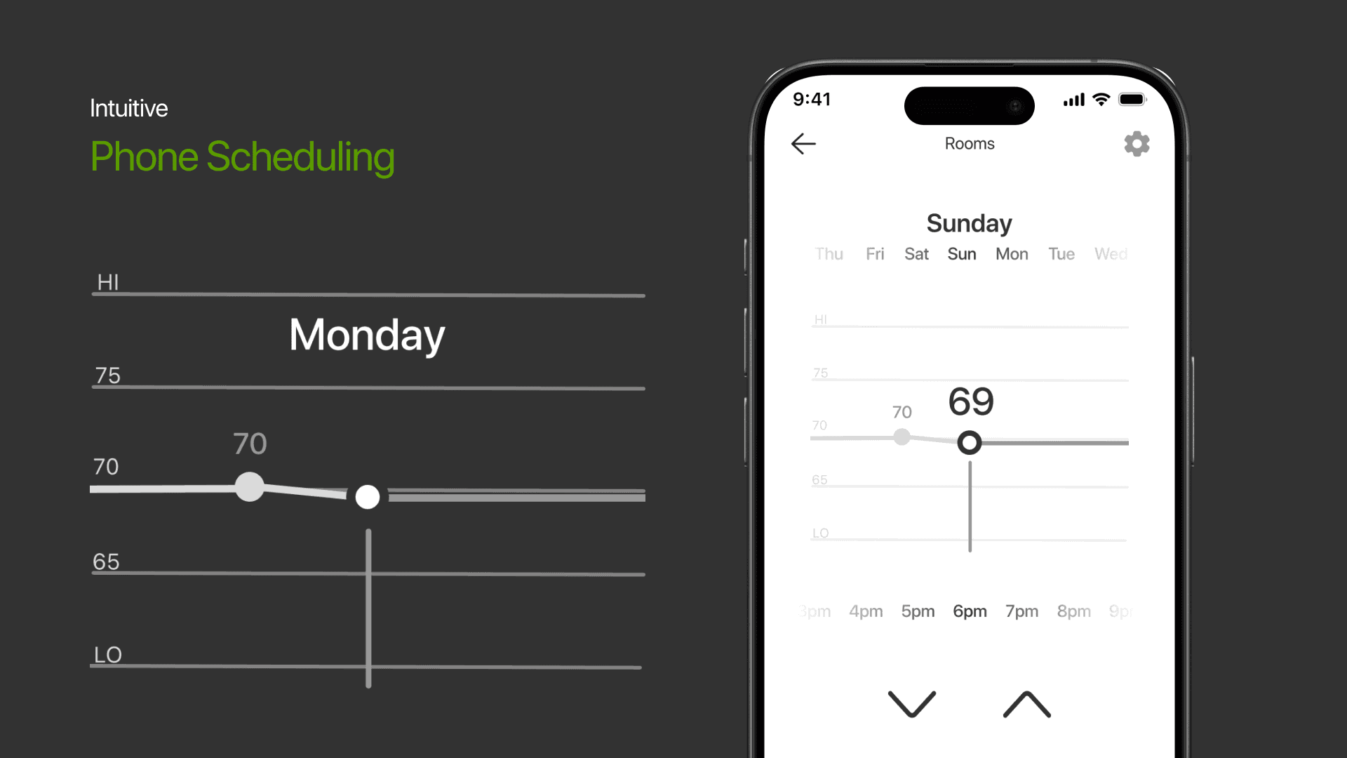
Wireframes
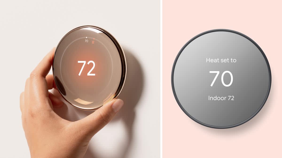
Prototype
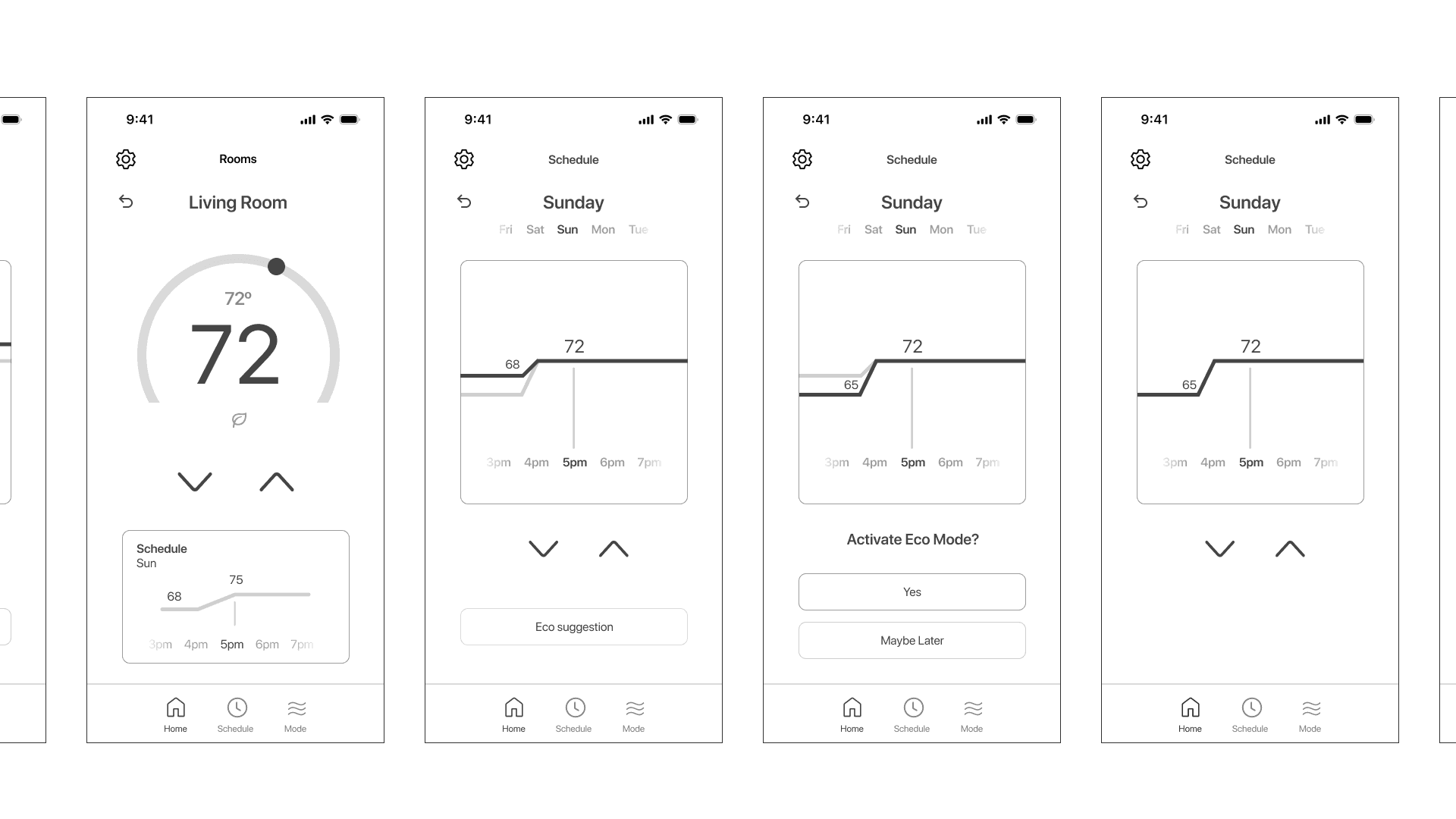
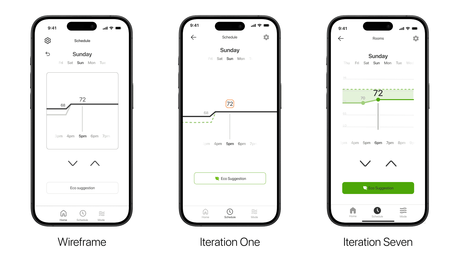
We created over 14+ iterations of our phone and thermostat based on user feedback.
User Testing
We conducted user testing on 10 individuals. Each individual spent about 10-15 minutes on the prototype and gave feedback on their experience. Once tested again, participants gave us a 83% user satisfaction score.
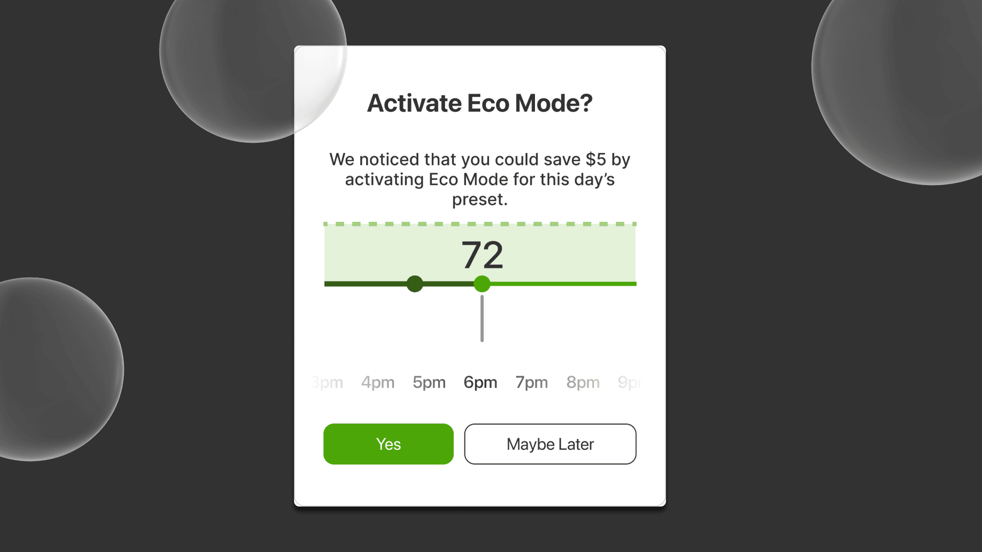
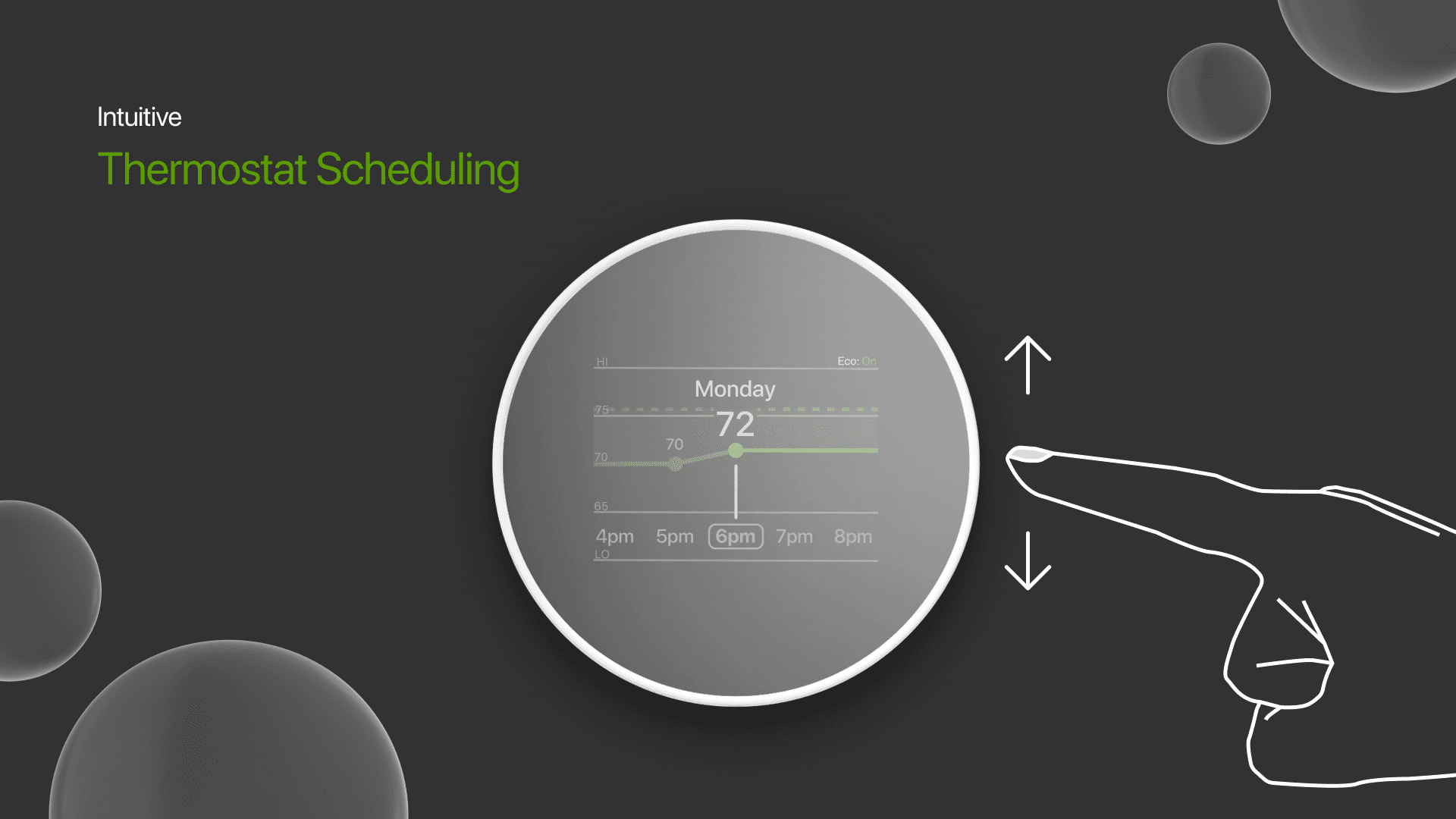
Insight 01
Users appreciate simplicity but expected better intuitiveness for scheduling.
Breakthrough: Users should have the ability to have both indirect and direct controls.
Insight 02
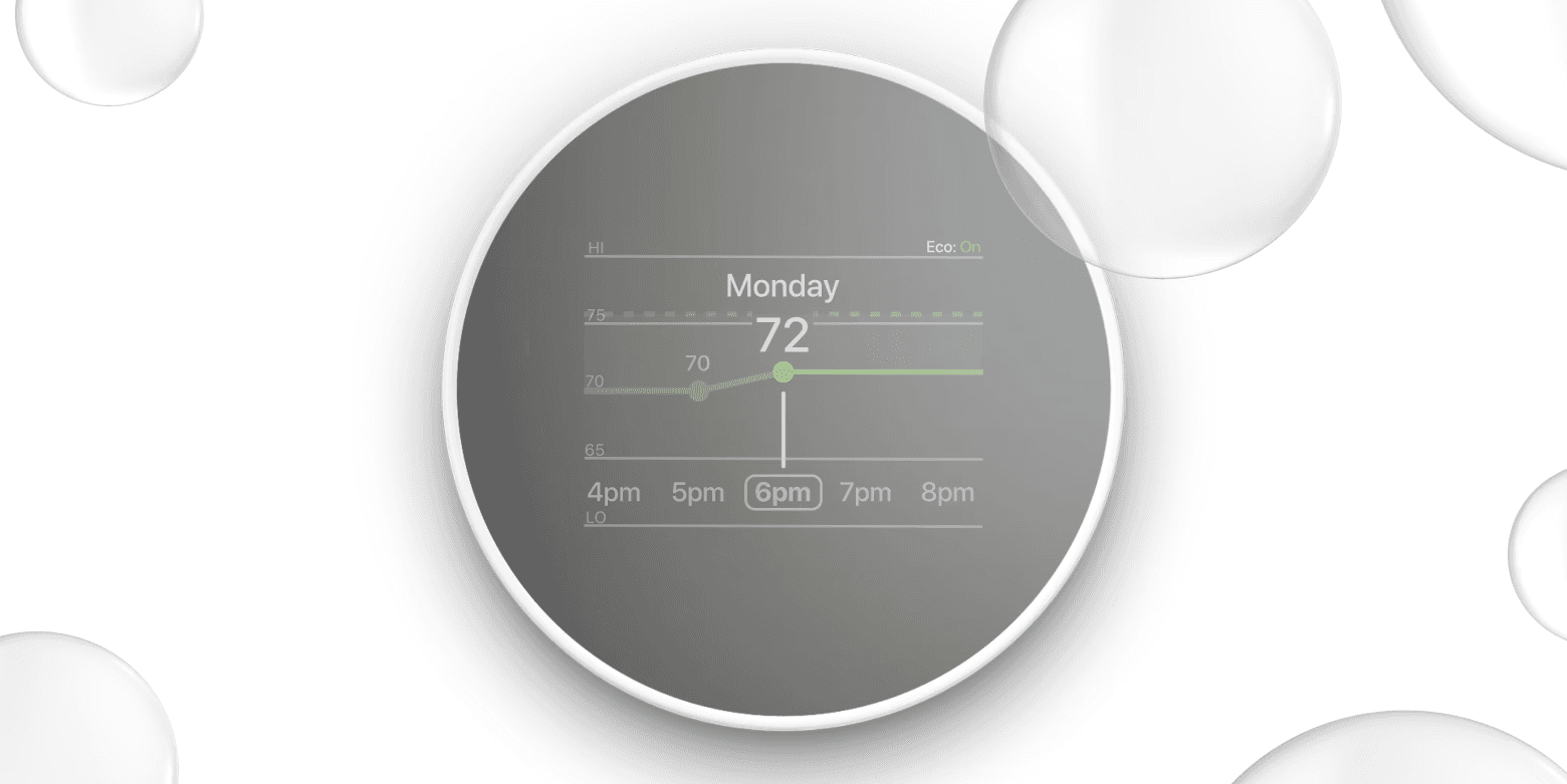
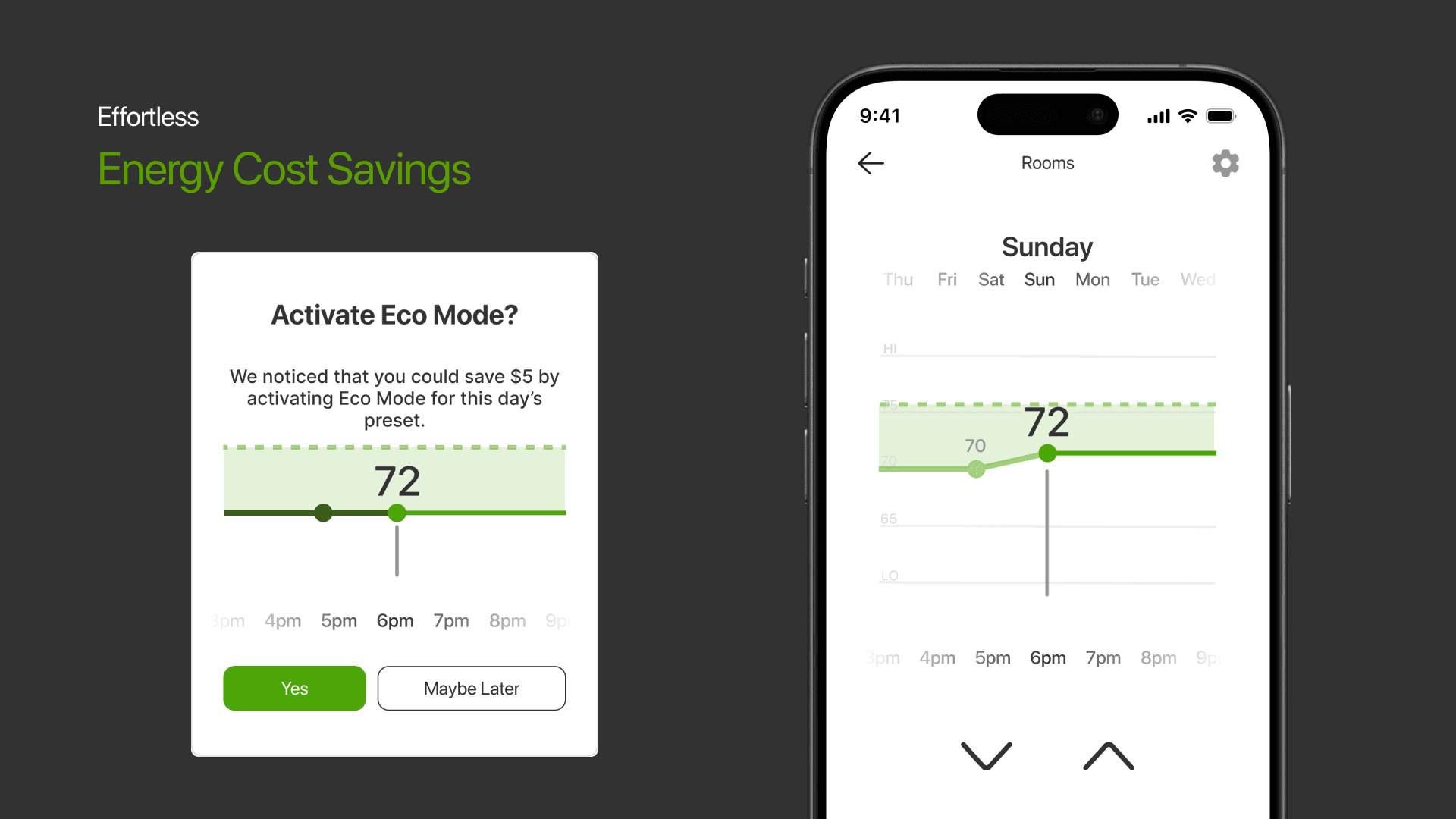
Eco mode is an intriguing feature, but lacked clarity for users.
Breakthrough: Increase clarity of system features that is more legible and understandable.
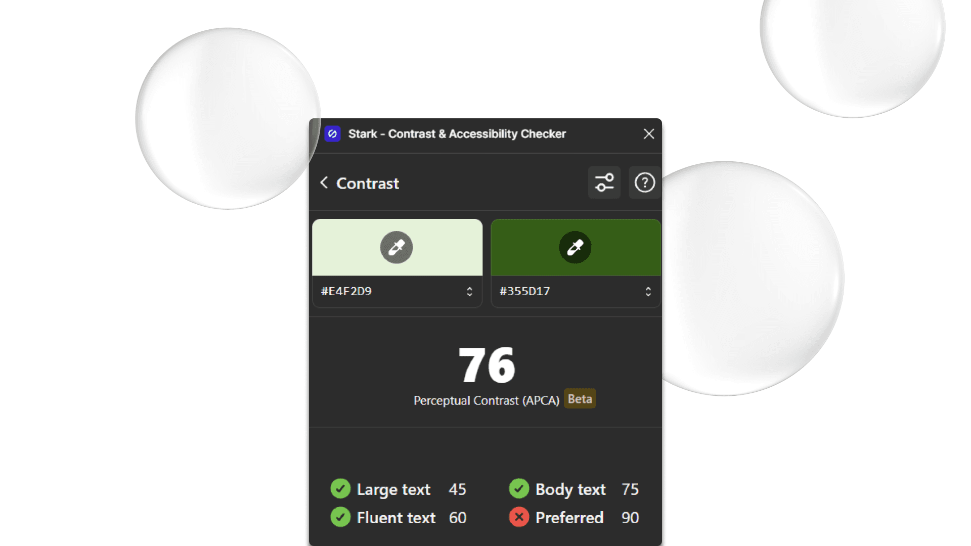
Insight 03
Color contrast needed enhancement to improve functionality and accessibility, especially in critical interaction points like scheduling.
Breakthrough: Using sources like the WCAG and Figma plug-ins like Stark to improve color accessibility can increase user retention.
Outcome
Reflection
What surprised me about this project was that going through multiple iterations powered by user testing sped up the success of the project by huge margins. Furthermore, open communication and being more confident in my work was a strength that propelled the team to feel comfortable.